Evaluation Question 2: How Effective Is The Combination Of Your Main Media Product And Ancillary Tasks?
Collecting the Images for my Ancillaries
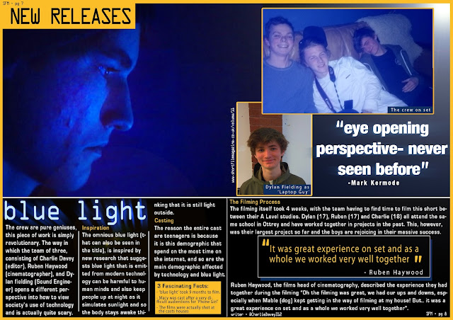
Due to the planned design for both my ancillaries, a specific photo-shoot wasn't required. Instead I screen grabbed footage from the film, took casual photos on the day of the shoot after we had finished filming, and finally took simple photos of Dylan (actor) and of Ruben's macbook for their respective photos in the ancillaries. The fact that the images were collected away from filming also emphasized the idea that the film is a representation of reality. It is hyperreal as it blurs the line between reality and film, with the film itself actually following an audience member watching people on a video chat.
This is the stock photo of the laptop used as the basis of my poster.
I have not included the other images as this is the only one that has been altered.
The GIF on the left showcases the chronological progression of my poster, with the poster on the right being the finished product for reference.
I used Adobe Photoshop to create my ancillaries, as this is a software I have used before and my skills with the software have greatly improved throughout this course.
For my actual media product (short film), we filmed the clips on a digital camera, before uploading the footage onto a Mac, then proceeded to edit using Premiere Pro, before encoding the footage of Adobe Encoder then uploading onto YouTube. In most cases of conventions in my film, I often developed, and adapted the conventions to show the changing society and how life is developing. However, there were numerous conventions that I challenged, such as having a linear narrative, and following Todorov's theory of Equilibrium. Rather than follow a traditional narrative with the film beginning and ending in equilibrium; equilibrium is never present in our film. According to our feedback panel and peers, the decision to challenge these conventions was effective as the new meaning was very apparent and the audience were not left confused as a consequence.
In my ancillaries, particularly my poster, the use of font was vital to connote meaning. The light effect that I created around the text is suppose to emulate the light given off from on screen text, and so when printed off, this poster would still emulate that effect.
In House Style & Colour Scheme
From my final three products one thing that is strikingly clear is that the lighting is the same. Although there may be added effects/filters on my poster and magazine article, the image is largely consistent and recognisable between all my images.
The font is different on my film than my ancillaries, but that is because I found that the desired font (which is used in my film) looks messy and hard to read when effects are applied and it is surrounded by other text. For this reason I decided to change the font for my ancillaries, however they all have a similar effect of blue light being given off by the text.
All pieces feature a large amount of blue and that is the main aesthetic of the brand of my film. The only major colour in the three products is orange in the double-page spread. This is because I wanted the spread to stand out in a magazine, so that those who flick through it will likely have a second look at the page. Orange is also the complementary colour to blue on the colour wheel so the piece stands out and is aesthetically pleasing


No comments:
Post a Comment